What Is a Candlestick?
A candlestick chart represents a stock's price movement over a fixed period (a day, an hour, etc.) using four prices: open, close, high, and low. It's named for its resemblance to a candle.
Periods where the close is higher than the open, versus lower than the open, are shown in different colors — the exact color scheme varies by platform.
Quick glossary
- ●Bullish candle: close is higher than the open
- ●Bearish candle: close is lower than the open
- ●Body: the rectangle spanning the open and close
- ●Wick: lines above/below the body marking the period's high and low
What a Candlestick Tells You
A single candle tells you whether buyers or sellers were in control during that period, how large the move was, and how much the price swung along the way. A long body signals strong momentum; a short one signals a near-even tug of war.
A long wick means the price moved sharply in one direction before partially reversing. A bullish candle with a long lower wick, for example, suggests the price was sold off hard but buyers stepped back in and pushed it back up by the close — often read as a sign of underlying buying strength.
The Basics of Reading a Chart
Reading trends from a sequence of candles
It's not just about one candle — the sequence matters too. A run of bullish candles suggests an uptrend; a run of bearish candles suggests a downtrend.
Higher highs and lower lows
Whether recent highs and lows are being broken is another basic checkpoint. A series of higher highs and higher lows points to an uptrend; lower highs and lower lows point to a downtrend.
Why a Candlestick Chart Game Beats Memorizing Definitions
Knowing the textbook definitions of bullish, bearish, and wicks doesn't always translate to instantly reading a real chart correctly — plenty of people freeze up on 'wait, is this bullish or bearish?' at first. Reading candlesticks is a visual pattern-recognition skill, and the fastest way to build it is repetition inside an actual trading game rather than a static article.
It clicks fastest when you can also see what news drove a given move. Repeatedly connecting 'this headline came out, so this candle was a big bullish move' — and being able to rewind and try that same moment again with no real money on the line — is the single best way to train your chart-reading instincts.
Practice Candlestick Charts in a Free Trading Simulator
Moshimo StockSim is a free browser and app-based trading simulator where every stock detail screen lets you switch between a line chart and a candlestick chart with one tap. A good approach: start with the line chart to get the big picture, then switch to candlesticks to practice reading bullish/bearish candles and wicks on real in-game price action.
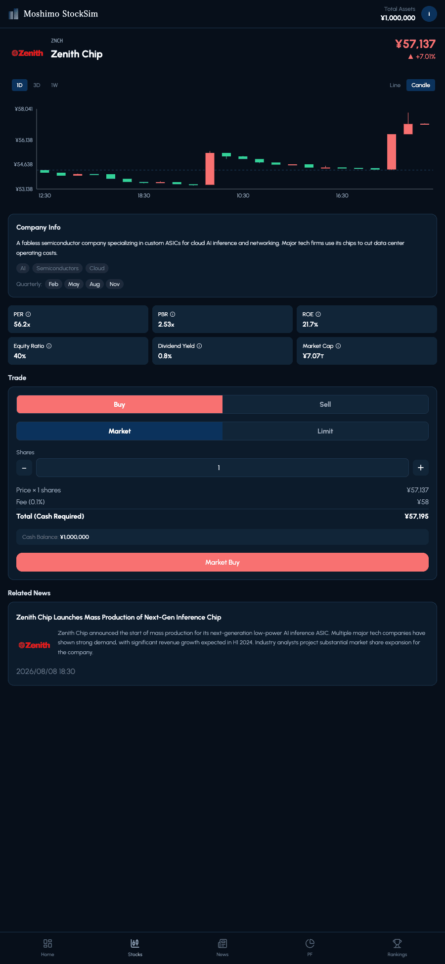
You can also switch between daily and weekly timeframes, making it easy to compare short-term moves against the longer trend. Since price action ties into in-game news, you get natural, repeatable practice reasoning about why a candle looks the way it does — no account or real money required to start.
Live prices from the shared market right now. Tap any stock to see its chart and news — no account needed.
Play free in your browserFAQ
Is there a free game to practice reading candlestick charts?
Yes — Moshimo StockSim lets you switch any stock's chart between line and candlestick view and trade on it with virtual money, so you can practice reading real price action for free without risking anything.
Should I look at candlesticks or a line chart?
Start with the line chart to get the big picture, then switch to candlesticks to practice reading detailed price action.
What does a candle with a long wick mean?
It means the price moved sharply during that period but partially reversed by the close.